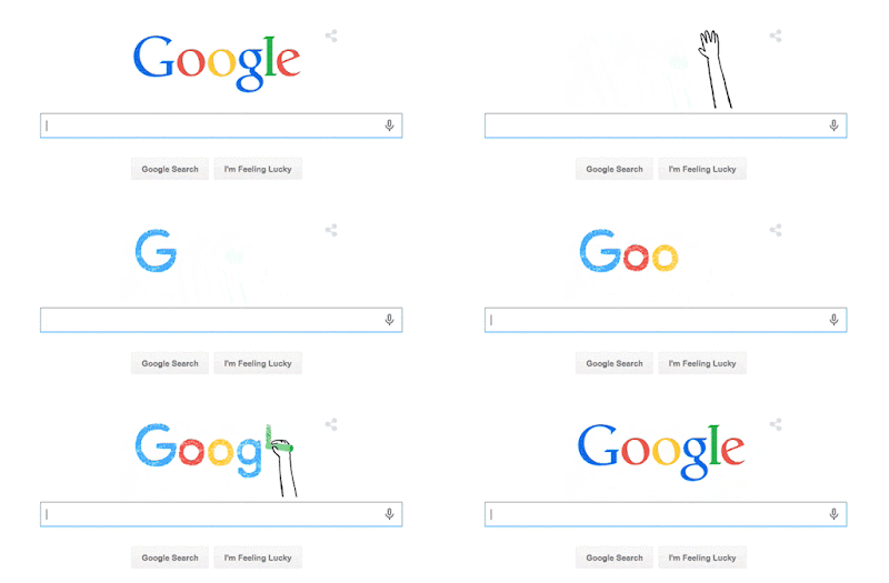
Googles New Logo - Makes me feel weird!
OK, is it just me or do a lot of us feel strange looking at that new logo?
I mean all these years it's been out old faithful logo now it's different! What does that mean for us? Will Google become "different"? A quick search of Google and you'll see I am not along in my feelings about the change:
Lucy Biggers (@LLBiggers) | Twitter
https://twitter.com/llbiggers?lang=en
New Google logo makes me feel weird. Like rearranging furniture in your house. Takes a while to get used to the new setup. #newgooglelogo. 0 retweets 1 Google has changed its logo and we don't really like it
www.cosmopolitan.co.uk/.../news/.../google-changes-logo-...
2 days ago - The search engine giant has revamped its logo with a brand new font, but users of the internet around the world have taken to Twitter to ...
Cosmopolitan
How does the logo make you feel? Did you even notice that it had changed? Do you no even know what all the hub bub is about?
You see some of us have been using the Internet since before there was a Google. Once again to pull from Sara's article "When Google first appeared, in the late nineties, it distinguished itself with a combination of intelligence and friendliness. Other search-engine sites were as cluttered and garbagey visually as they were inefficient functionally, simultaneously trying to sell and inform and bamboozle. AOL, with its goofy mailbox, bulky structure, and overpriced hand-holding service for the terrified, was obviously up to no good. Others—Yahoo!, HotBot, Netscape, Ask Jeeves, and so on—seemed well intentioned but were harder to parse.
Google’s design, in comparison, was a revelation. It had true confidence. It didn’t need to pretend to be the post office or a butler. The white glow of a clean, bare screen, the brightly colored, old-fashioned letters, the name that came from math and whimsy—it was all very promising, and its brilliance spoke for itself. The logo was a key part of this. The letters’ literary old serifs were subtly authoritative. The design, like the site, didn’t patronize or manipulate—it said, Relax, we’re reasonable geniuses" (OK, the Logo change was one thing, please don't change the site design!) The entire article can be found here: Why We Hate Google's New Logo
"You will very soon notice that Google has a new logo that’s sleeker, brighter, and for the first time, animated. And then, you probably won’t notice it at all." Starts the article written by Mark Wilson of fastCo Design. Mark has a really in depth article showing the changes on the logo and talking more about the font type. You should read the whole thing here: Google's new Logo - Biggest Change in 16 Years
Google went from being the way we find trivia to becoming the digital infrastructure of our lives. And in turn, they’ve created a new logo and brand identity, out today. The bold new logo preserves the old logo’s most recognizable element—the famous blue-red-yellow-blue-green-red color sequence—but presents the company’s name in a bespoke typeface called Product Sans inspired by schoolbook letter-printing. The new word mark will replace the one that’s appeared above the search box since 1999. I personally think it looks just like the G from the Golf Channel so I had to pull both pages up on my PC at the same time only to find out Golf Channel has changed to the NBC logo!
Some web sites even went as far as to say "Google's new logo was "ALL Wrong".
You can always visit is on Facebook at: https://www.facebook.com/pages/Computer-Tutor/127115018991
Sara Larson's article on "Why We Hate Google's New Logo" helped explained to me why it was I hate the log each time I look at it. She says of Google's new logo " it sheds the grownup curlicues: it now evokes children’s refrigerator magnets, McDonald’s French fries, Comic Sans. Google took something we trusted and filed off its dignity. Now, in its place, we have an insipid “G,” an owl-eyed “oo,” a schoolroom “g,” a ho-hum “l,” and a demented, showboating “e.” I don’t want to think about that “e” ever again. But what choice do I have? Google—beneficent overlord, Big Brother, whatever you want to call it—is at the center of our lives. Now it has symbolically diluted our trust, which it originally had for all the right reasons."
Remember, if you enjoy what you are reading here it was brought to you by your friends at Computer Tutor321. Computer Tutor321 is located at 1510 S. Wickham Road, in West Melbourne Florida 32904. Simply seniors Computer Tutor specializes in working with clients age 50 plus. We understand the unique needs of seniors! To learn more about us please visit www.ComputerTutor321.com
You can always visit is on Facebook at: https://www.facebook.com/pages/Computer-Tutor/127115018991


No comments:
Post a Comment